Football shirts: Ranking the Premier League's home jerseys for the 2023-24 season
From worst to first, which shirts look the best going into the new campaign?
There was a time, I looked forward to Premier League teams launching their brand-new kits every summer. Unfortunately, the excitement isn’t quite the same due to leaked images hitting the Internet well before the previous football season ends.
Adding to the lack of excitement is the top Premier League teams wearing their kits for the final matches of the previous season, ruining the excitement. No longer does it feel like Christmas when a new kit is launched. Rather, it feels more like World Compliment Day.
Still, the launch of new Premier League kits is something special, and there are always hits and misses when it comes to new shirts. With the Premier League kicking off in just a few weeks, I looked at all 20 Premier League home shirts for the 2023-24 season, ranking them from worst to first.
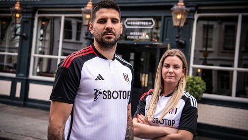
20. Fulham
This is not good. Fulham’s new jersey looks a mess, like Tony Khan’s AEW promotion. There is too much going on. The body of the shirt has subtle stripes. The black shoulders and arms add nothing to the design. Making it worse is the red Adidas three stripes on the right shoulder and the white Adidas three stripes on the left shoulder. Then, Adidas threw in a button collar. Awful!
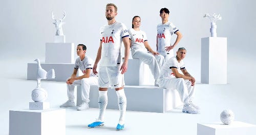
19. Tottenham Hotspur
Tottenham said, “Nike, can we have a white shirt?” So, Nike responded, giving Spurs a white shirt with very little detail. Some will say this has a classic look and feel. Others will say Nike’s design team didn’t try.
18. Brighton
Brighton have gone for a subtle v-neck collar. It adds life to another kit with vertical stripes. For this season, the Seagulls shirts have solid blue shoulders and arms. There is a lot of blue on this Nike-made shirt.
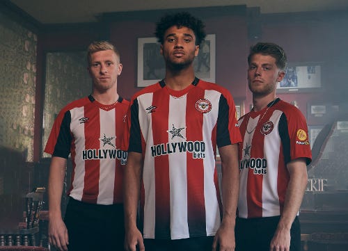
17. Brentford
Brentford decided to launch a new home kit every two years, just like the good old days. The idea is to stop flooding the market with shirts every season. Buying your favourite team’s shirt is an expensive job, so Brentford’s fans can save some money every season. Moreover, the Bees are aiming to lower their carbon footprint by making fewer shirts each year. If a fan had to wait two years for this season’s Brentford shirt, then it wasn’t worth it, however. Of course, it is difficult to do something new with vertical stripes. The black accent is okay, but overall, this is slightly underwhelming.
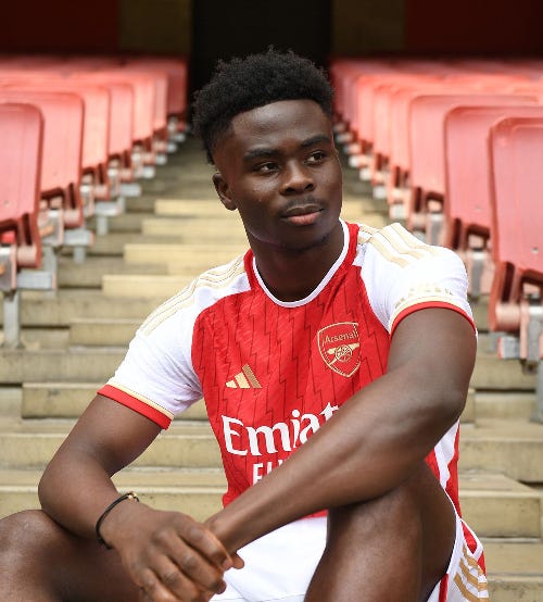
16. Arsenal
There is only so much you can do with an Adidas-made kit. Sure, Adidas has produced some stellar jerseys over the years, and they fit great. But Arsenal’s new shirt just looks basic. It has the traditional red body and white sleeves Arsenal are known for. The three stripes down the shoulders are gold. A white thin collar was added to the crew neck to give the shirt more detail. Overall, the shirt is just, blah.
15. West Ham
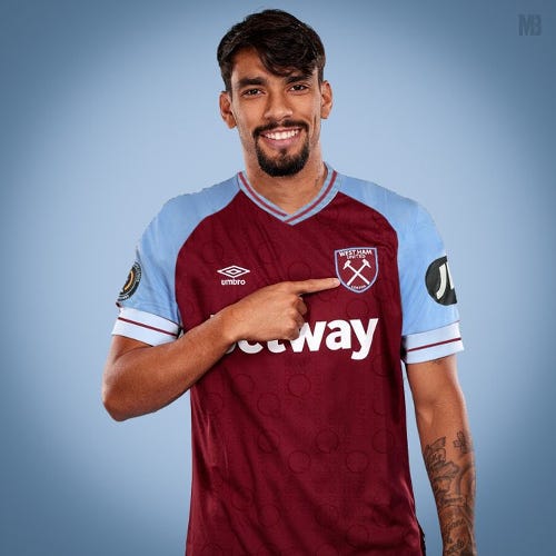
West Ham have brought back the solid blue sleeves for the upcoming season, with their all-new Umbro kit. The best part about the jersey is the strange, curved lines that appear randomly. It is a solid release and follow-up to last season’s shirt.
14. Luton Town
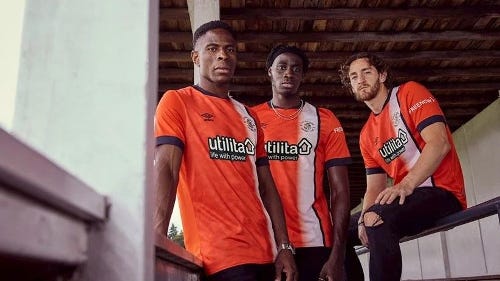
Premier League new boys Luton Town will be the only Premier League team wearing orange as a home colour next term. Orange isn’t a common colour in English football when it comes to home kits (Luton, Blackpool), so it is refreshing to see something different. Umbro produced Luton’s top which features one vertical stripe down the front. It is a strong first effort for the Hatters.
13. Chelsea
Chelsea’s new home kit is interesting. There isn’t a lot to it, but some Chelsea fans will be happy, with the lack of detail. The badge is gold but fades to blue. The white ring around the sleeves is a nice touch. There isn’t a lot of white and gold on the shirt, making it mostly a blue top. The tight crewneck collar adds to the jersey looking very slim and form-fitting.
12. Aston Villa
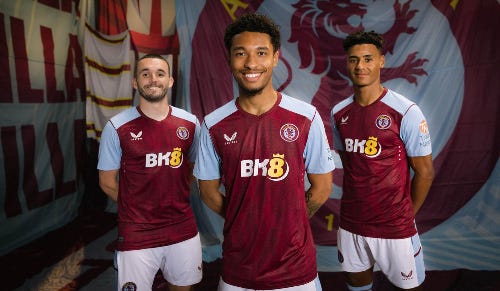
Aston Villa’s Castore-made kit looks alright, but the talking point around the jersey is the new club badge. After consulting with fans, the club launched its new badge, which could easily be mistaken for Chelsea’s crest. Villa want to be global and didn’t feel the previous badge gave them a worldwide appeal. As for the new kit, it looks okay, but it isn’t groundbreaking – which is often a good thing. Castore hasn’t got a great reputation in the football kit world. Regardless of the company’s reputation, the designs look sharp compared to some of the bigger brands’ output.
11. Manchester United
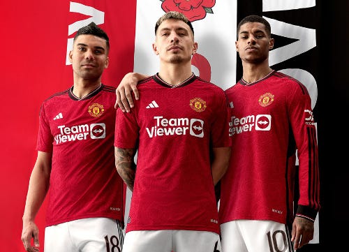
Another lifeless Adidas release. Manchester United’s Adidas-made shirt is much better than Fulham’s, but there is still something a bit ordinary about it. At least the shirt doesn’t have different coloured stripes down opposite shoulders. The collar adds some detail to the shirt, with its little overlap feature.
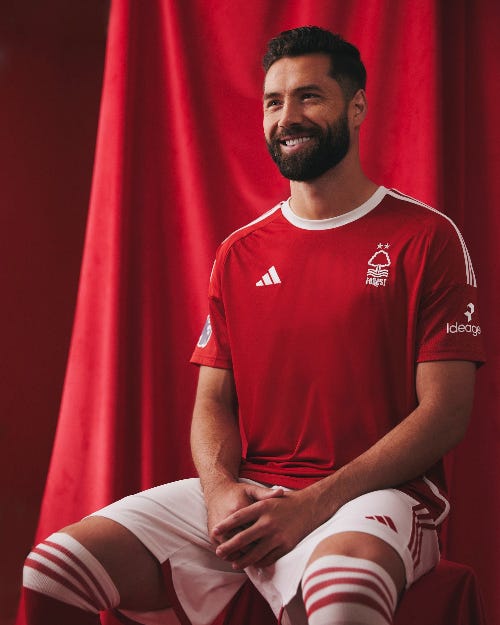
10. Nottingham Forest
Nottingham Forest’s Adidas-made home shirt is everything Fulham’s isn’t. It is a clean red shirt with white detail. It is classic looking. There isn’t much more to say about Forest’s top.
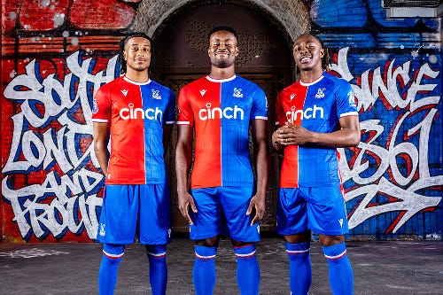
9. Crystal Palace
Crystal Palace have a shirt that is difficult to alter each season. But the club isn’t afraid to mix things up each season. One season, the Eagles wear stripes and the next they sport a shirt with a half-and-half colour design. The Macron-produced Crystal Palace’s shirts once more for the 2023-24 season. The jersey has a silhouette of the original Crystal Palace in London. Unfortunately, at first glance, it looks like a spiderweb. So, the shirt isn’t advertising the next Spider-man film?
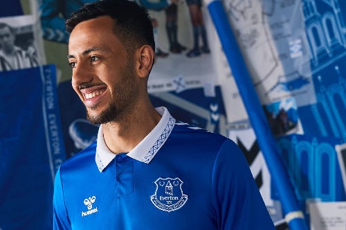
8. Everton
Hummel makes some of the best kits today. While Adidas and Nike continue to trot out the same old boring designs, Hummel is doing something a bit different. Everton’s latest jersey looks good. It's clean, bright, and classy. There is a fold-over collar, adding to the old-school style. Perhaps the only gripe about the Everton shirt is that it looks a little too much like Burnley’s.
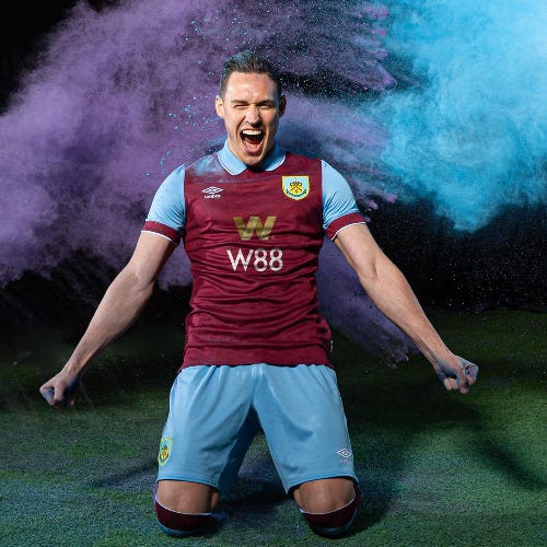
7. Burnley
Now, we’re talking! Burnley have brought back the collar. Yes, the Clarets’ 2023-24 Umbro kit will have a fantastic fold-over collar. I know a lot of footballers hate a fold-over collar, but they look so good. The claret and blue look great on the top, and Vincent Kompany’s team should play some very attractive football in these jerseys. The only issue is the new sponsor on the front of the shirt. Burnley have opted for W88 rather than last season’s front-of-shirt sponsor Classic Football Shirts.
6. Manchester City
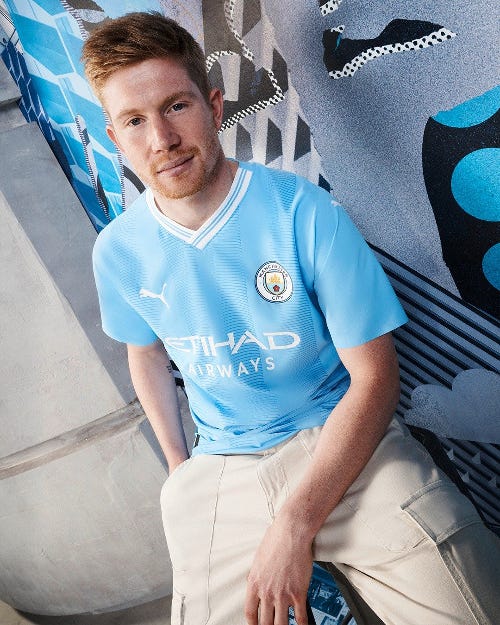
Manchester City’s new shirt is a celebration of the Etihad Stadium. The club moved to the ground 20 years ago and the new top is an homage to the team’s first season in the stadium. There is some detail on the shirt like the postcode of the stadium on the back of the neck. The v-neck collar may be the best part of the City shirt. It makes it stand out, giving the jersey life.
5. Newcastle United
Newcastle have a hot shirt for their return to the Champions League. A black-and-white striped jersey is difficult to beat. You don’t have to be a Newcastle or Juventus fan to like the classic look provided by a black and white top. Castore did a fine job with the jersey, adding subtle blue detail. The blue is practically unnoticeable but looks nice when up close.
4. Wolverhampton Wanderers
Although Wolverhampton’s official home shirt hasn’t been released yet, leaked images are available online. Produced by Castore, the new Wolves shirt is a brilliant piece of material. The collar and sleeves make the shirt pop and break up the old gold. Speaking of old gold, Wolves’ shirts keep creeping further into the region of yellow. Let’s stop that!
3. Liverpool
Okay, I am partial to this shirt, as a Liverpool supporter, but this is Nike’s best attempt at a Liverpool home top. After two years of bad releases, Nike had a winner in 2022-23. Now, the American sportswear company is back with another top design based on shirts from the past. It is funny that Nike produced two Liverpool home tops based on their own ideas and fan response was mixed. Starting last season, Nike re-designed previously worn Liverpool shirts, and fans loved them. Old is new.
2. Bournemouth
The new Bournemouth home shirt looks fantastic. The Umbro-made jersey is more black than red with its straight vertical lines. It is a clean-looking shirt, with a crewneck. There are no squiggle lines or contrasting flashes of colour. Bournemouth’s new jersey is simply smart looking.
1. Sheffield United
The Blades are the only team in the Premier League with an Errea kit deal, making their shirts unique for this season. The Italian company has hit a home run with the Sheffield United kit. Sometimes it takes the small companies to produce the best-looking jerseys. The collar matches the sleeves, producing a strong visual. The collar shape is also top-notch. Rather than going for a shirt front filled with stripes, Errea placed just two white stripes on either side of a solitary red stripe down the middle of the shirt. It works well.


